Espresso Reader app for iPhone and iPad
- "Simple, beatiful and useful"
- "Rarely something so simple is so good..."
- "This app is gorgeous. Every reader client I have tried has been so ugly. If you like beautiful design this is the perfect app. I am now an espresso user :) thank you!"
Note: If you get some crashes after iOS 7.1 update, please reinstall the app and it will work
Welcome to Espresso.
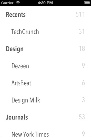
Espresso is a minimalist Feedly client which let you read all your feeds on a easy and fast way.
GESTURES
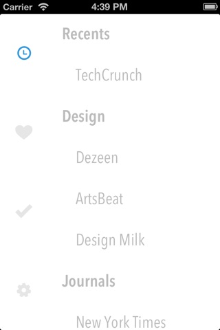
By swiping through the pages you can easily read your feeds and items. Access to your unread, readed and starred articles on a single movement. Compatible with folders too!
COMFORTABLE READ
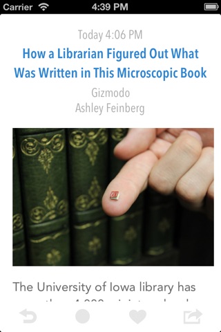
Enjoy reading your articles on a eye-friendly way, change the font size so you can read as you like.
BLACKLIST
Do you want to read only interesting stuff? Block these articles that are not news (no more rumors :P). Espresso will read them automatically for you.
SHARE
Let your friend know what are you reading sharing it on email, message, twitter, facebook...
POCKET COMPATIBLE
Save your articles on Pocket to read it later.
Pros and cons of Espresso Reader app for iPhone and iPad
Espresso Reader app good for
with simplicity and usability this app knocked out other major RSS reader apps.
Im really loving this app, is minimalistic, fast and easy to understand.
I hope developers can develop a night reading mode.
The app is awesome, I enjoyed using it for reading RSS feeds in English.
But when it comes to Russian feeds, all the titles in the feed look horrible, because an ugly is used to substitute missing letters in the original beautiful font. Articles text is displayed OK, though.
If I werent reading feeds in Russian, it would be definitely 5 stars, but boy, since I got this app for free, I still give 5 but humbly hope for future improvements of cyrillic alphabet support :) Thanks for the app!
It is simple and smooth... It loads quick and in an easy way... Four star because it has a lack... Once u entered in a feed it is not possible to swipe or tap some arrow for the next, the only way is going back and choose another one... This has to be changed!! But very nice app!! Continue developing...
Some bad moments
Installed. opened, closed. removed. I wasted one minute of my life.
This app requieres a sign. in with google+. Maybe I did something miss in the Description. But why the hell needs a feed reader a sign in?
The provides a great service however, it shut down quite a bit
Great job on the looks! Please add missing features: Pocket integration (read it later), pull to go to next article, feed sorting and folders to mimic google reader folders. Also once installed, icon looks different than in app store. Perhaps way to change the color blue to a user selected color. Dark theme? I know it is a lot of request but your app has great potential! I love the design!!
This app is gorgeous. Every reader client I have tried has been so ugly. If you like beautiful design this is the perfect app. I am now an espresso user :) thank you!
I like the design and simplicity. Has potential.
However, Id like more sorting options. Also I really dont like that in the article list view, the pull to refresh motion is not a way to refresh, it marks all items as read. That can be dangerous, seeing how in the folder list view its a normal pull to refresh. Kind of contradictory to have one motion mean two things within the same app (but different screens).
The share screen is awesome. I like the tap and hold to mark/unmark items.
Im looking forward to any improvements that may come over time. It has the potential to be my standard reader.
Very nice google reader...if you like simplistic readers...this is the one...please make this an universal app


